Living Room Color Scheme Ideas: 18 Combos You’ll Actually Want to Try
Let’s be honest: choosing a color scheme for your living room feels way more dramatic than it should. I mean, you’re only painting walls and tossing in a few pillows, right? But somehow, picking that one perfect combo feels like you’re designing a whole identity. Been there. Still recovering from that neon yellow phase.
If you’re stuck in analysis paralysis, don’t worry—I’ve got your back. Whether you’re craving calm neutrals or wild jewel tones, these living room color scheme ideas will help you pick a palette that actually feels like you. Let’s jump into the good stuff, yeah?
1. Classic White + Navy Blue
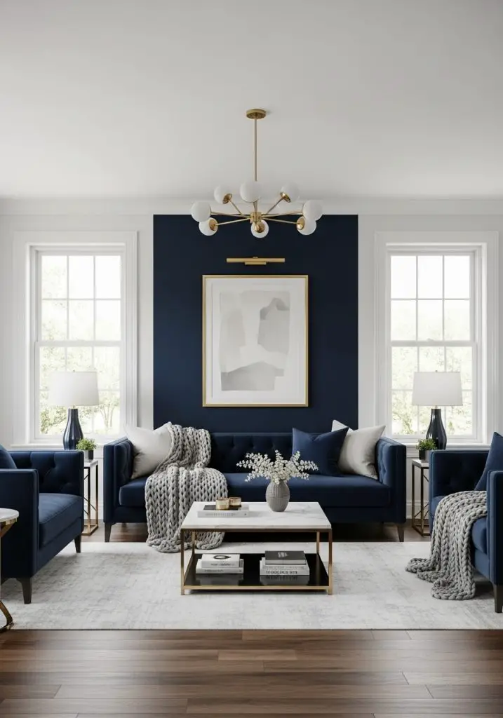
There’s just something timeless about crisp white walls paired with deep navy accents. It feels coastal, but not theme park coastal. Add a navy velvet couch or some chunky knit throws, and boom—your space suddenly feels curated. I paired this combo with gold fixtures once, and honestly, I felt fancy AF.
Why it works:
- High contrast without feeling too bold
- Navy adds depth, white keeps it fresh
- Works well with modern or traditional styles
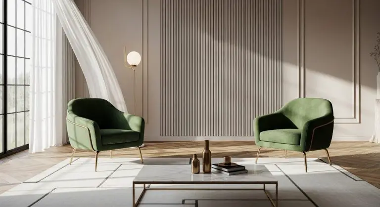
2. Sage Green + Creamy Beige
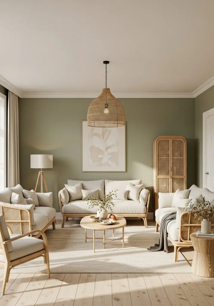
Living room color scheme ideas don’t all have to be high drama. If you’re into calming vibes and cottagecore dreams, sage and beige is your gentle hug in color form. I used this in a rental and didn’t even hate it under bad lighting (that’s saying something).
Tips:
- Mix textures like linen and rattan
- Add terracotta or wood accents for warmth
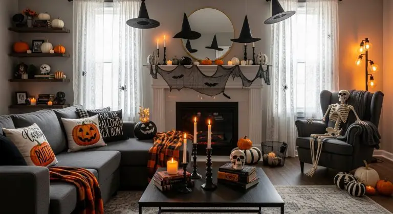
3. Charcoal Gray + Burnt Orange
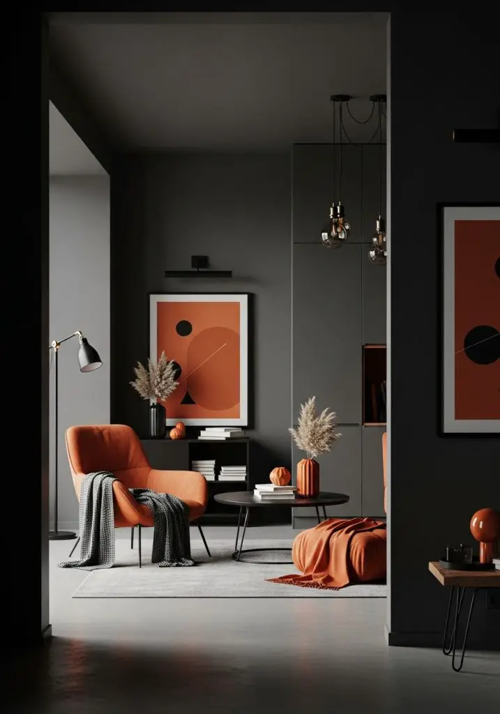
Want moody but not “help-I-live-in-a-cave” moody? Go for charcoal gray walls and punch it up with burnt orange accents. Trust me, it gives autumn vibes all year without smelling like a pumpkin candle exploded.
Perfect for:
- Loft spaces or industrial-inspired rooms
- Anyone who secretly loves Halloween but wants to stay chic 😉
4. Blush Pink + Warm Taupe
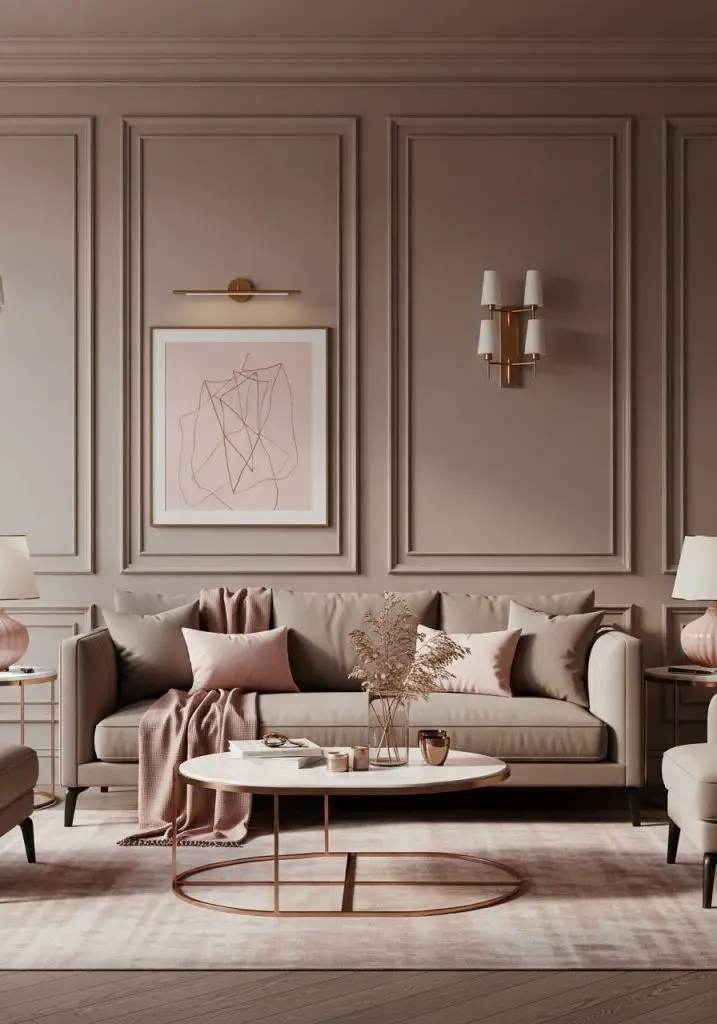
This one’s got that grown-up glam feel. Not Barbie-pink, more like “rose gold champagne” (you know the one). I love using blush pink in throw pillows, paired with taupe on the walls or sofa.
Hot Tip: Add brushed brass for a hint of luxury.
5. Olive Green + Mustard Yellow
Okay, this sounds risky. But hear me out—it’s like the retro comeback we actually wanted. Earthy and grounded, but also playful.
Make it pop:
- Go for matte finishes
- Use patterned rugs or wall art to tie things together
6. Black + White + Wood
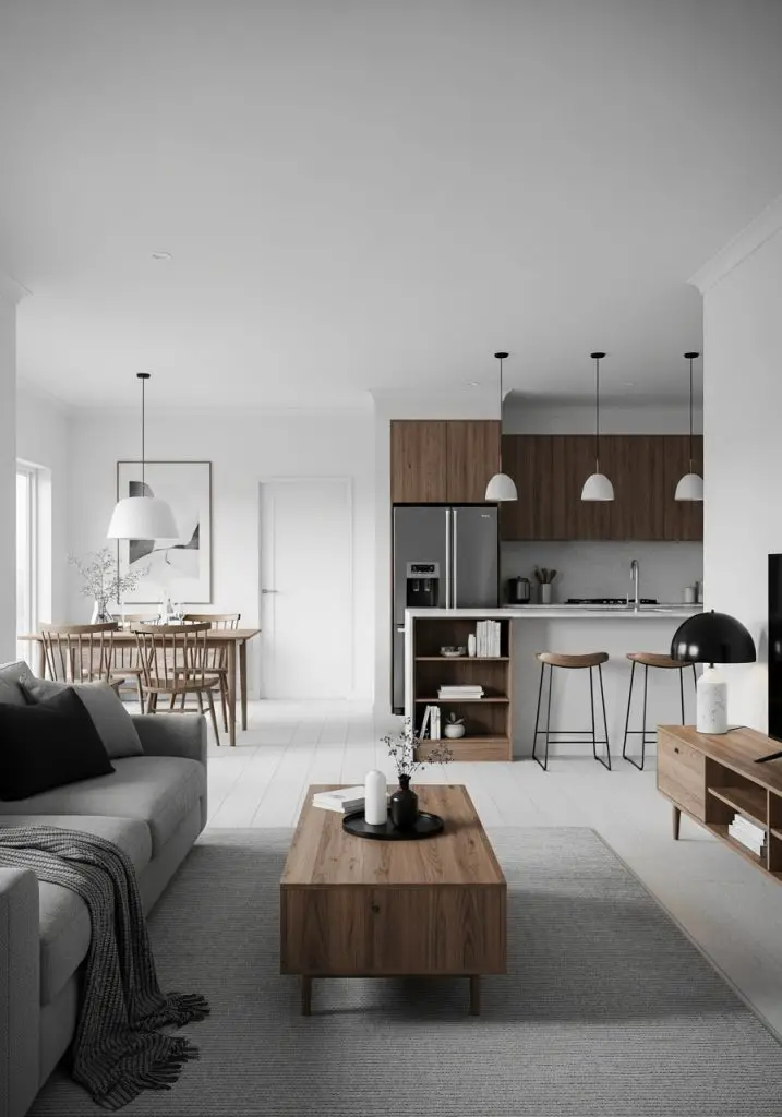
Minimalists, rejoice. You can have a sleek, simple palette without it feeling cold. The secret? Wood tones. Add a wooden coffee table or shelving to break up the monochrome.
IMO, this combo always slaps.
7. Soft Blue + Bright White
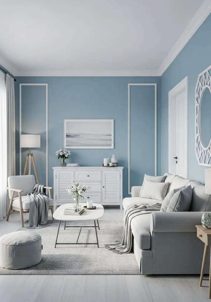
There’s something about this combo that makes you want to exhale. Maybe it’s giving beach house? Maybe spa day? Either way, soft blue walls and white trim = chef’s kiss.
Pro tip: Add cozy textures so it doesn’t feel too sterile.
8. Terracotta + Cream + Olive
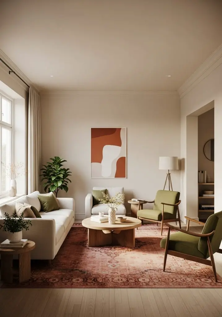
Yes, this is a three-color scheme—but it works like a charm. I used this combo in a friend’s Airbnb and now I want to steal it for my own place.
Why it works:
- Earthy tones feel grounded
- Cream keeps it light and open
- Terracotta brings cozy drama
9. Dusty Lavender + Gray
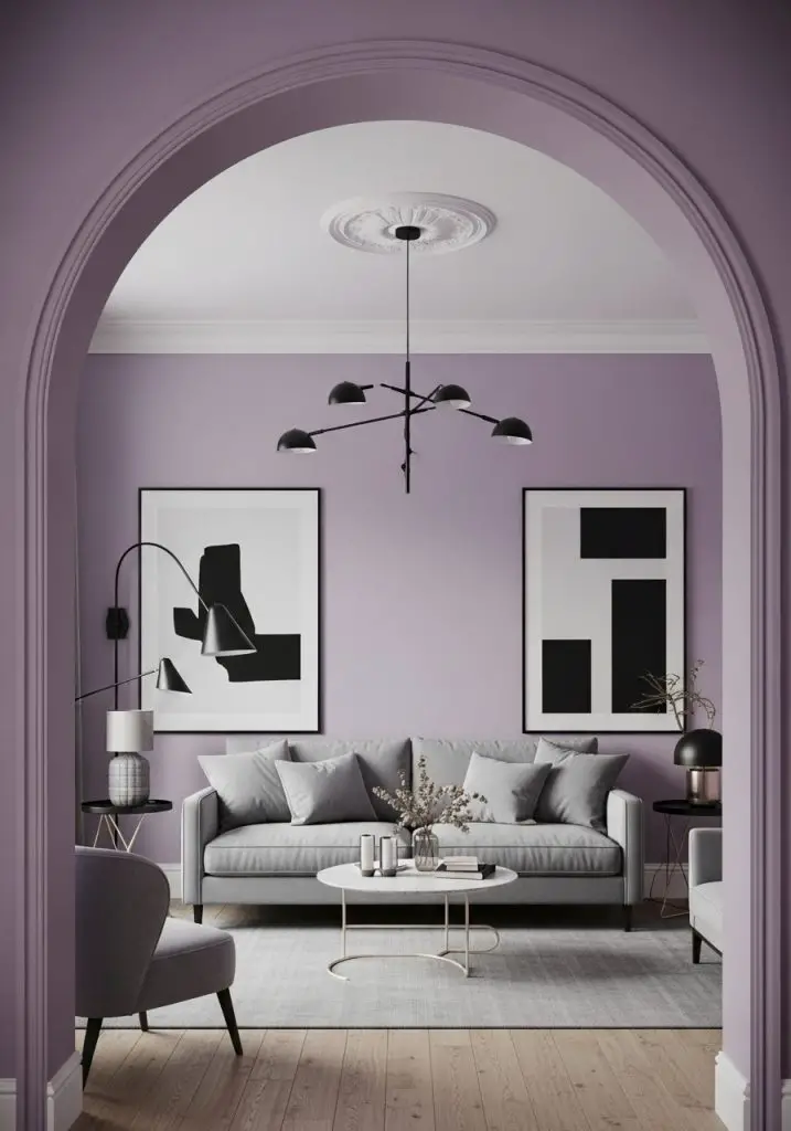
Feeling a little whimsical? Dusty lavender gives off those dreamy vibes without screaming “teen bedroom.” Pair it with a soft gray sofa or rug to balance it out.
Add drama with: Black light fixtures or bold art pieces.
10. Forest Green + Tan Leather
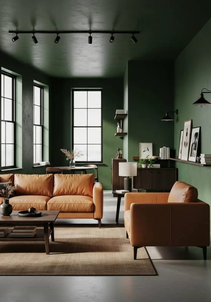
This one’s a little rugged, a little luxe. Forest green walls with tan leather furniture?
It’s perfect if: You want something masculine but still stylish.
11. Peach + White + Gold
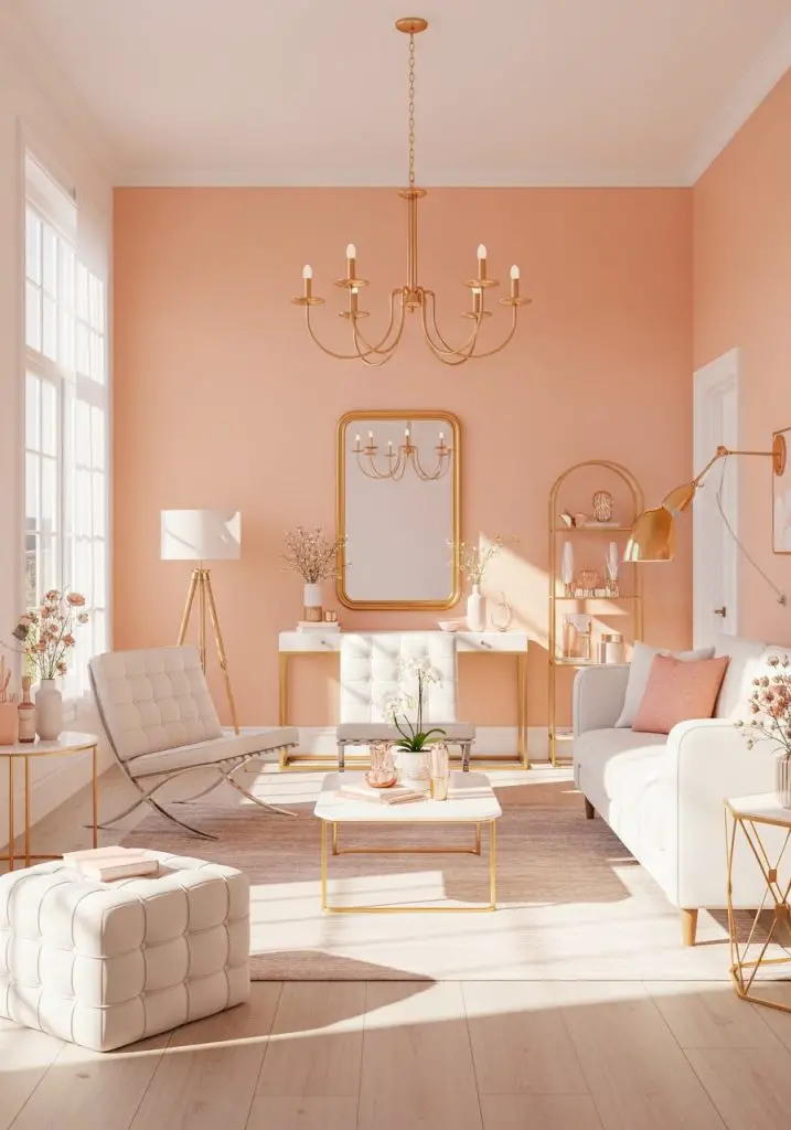
Yes, peach is having a moment. (No thanks to Pantone’s Color of the Year.) But with white and gold? Total glow-up. Think soft glam meets vintage flair.
FYI: Metallics go a long way here.
12. Gray + Yellow
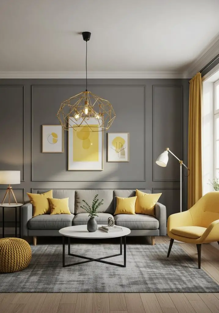
Remember when this combo was all over Instagram? Yeah, it still works—especially if you tone down the yellow to a soft butter or marigold.
Use yellow in:
- Pillows
- Wall art
- Accent chairs
13. Beige + Black + Greenery
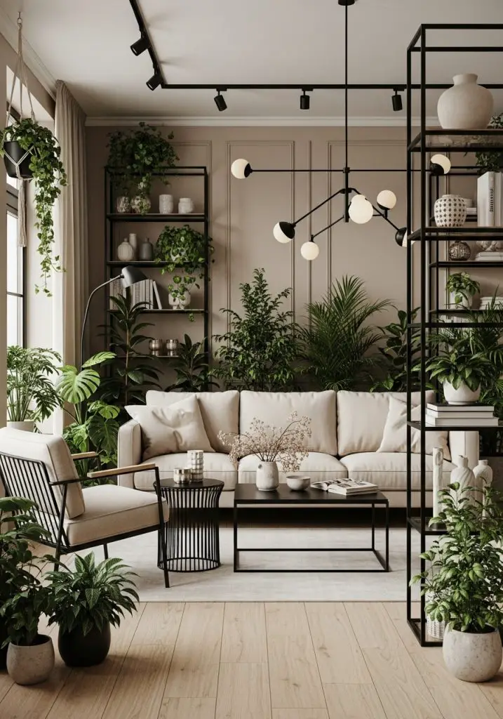
Okay, technically the green comes from your plants. But this combo slaps if you’re into neutrals with a little flair. Beige walls, black accents, and loads of plants = vibe secured.
Bonus: The plants give you something to talk to. Just me?
14. Soft Coral + Navy + White
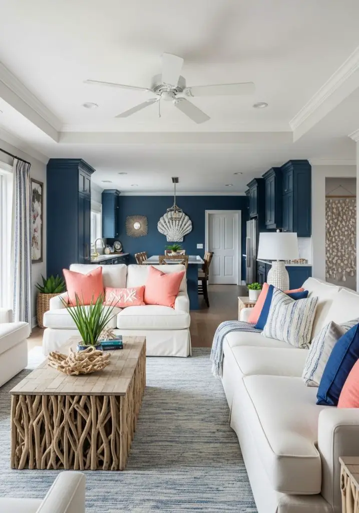
This one feels nautical but make it fashion. Coral adds a warm energy, navy grounds it, and white keeps it light.
Best for: Beach homes, or anyone who owns at least one seashell decor item.
15. Ivory + Emerald + Brass
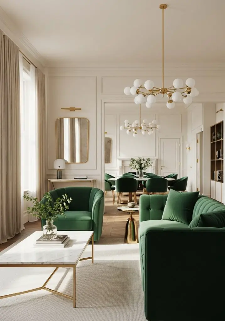
This one screams elegant. Emerald green velvet with ivory walls? Yes please. Add some brass light fixtures or a mirror and you’ve got modern glam done right.
Pro Styling Tip: Go for velvet. Always velvet.
16. Mocha + Slate Blue
Warm meets cool in this underrated pair. Mocha tones bring the cozy, slate blue adds a bit of mystery.
Ideal for: Reading nooks, cozy couches, and people who hoard throw blankets.
Final Thoughts
Choosing the right living room color scheme ideas isn’t about following a trend—it’s about figuring out what feels right in your space. Whether you’re bold, chill, or somewhere in between, there’s something here for everyone.
So what’s your vibe? Earthy and grounded, or fresh and bright? Whatever you choose, just remember: worst-case scenario, you can always repaint. (Said with deep, personal experience.) 😉
Need help picking the right shades or styling around your palette? Drop your questions in the comments or shoot me a DM—I’m always happy to talk color.

Michael Chen is Certified Kitchen Designer with 12 years of experience, he is known for blending style with smart functionality. he is the proud winner of the 2023 National Kitchen & Bath Design Award, and through HouzGem, he shares expert tips and inspiration to help readers create beautiful, efficient kitchens and home spaces.