Luxury Living Room Colour Combination: 15 Stunning Ideas That Actually Work
Let’s cut to the chase—your living room doesn’t feel as luxurious as you’d like, right? You’ve got the sofa, maybe even that dreamy coffee table, but the colours… yeah, they’re not exactly screaming “five-star lifestyle.” That’s because the right luxury living room colour combination isn’t just paint on the wall. It’s mood, atmosphere, and honestly, the difference between “nice house” and “where did you hire the interior designer from?”
I’ve been through this process myself—standing in the paint aisle staring at swatches like they were math equations. But once you crack the code on colour combinations, everything changes. It feels like cheating because suddenly your living room looks more expensive without you actually blowing the budget.
Below, I’ve rounded up 15 killer colour combinations that instantly add a luxury vibe. Each comes with pros, cons, personal takes, and even a sprinkle of humor (because let’s face it—design should be fun, not stressful).
Ready to make your living room feel like a luxury magazine cover? Let’s dive in.
1. White & Gold – The Timeless Luxury Duo
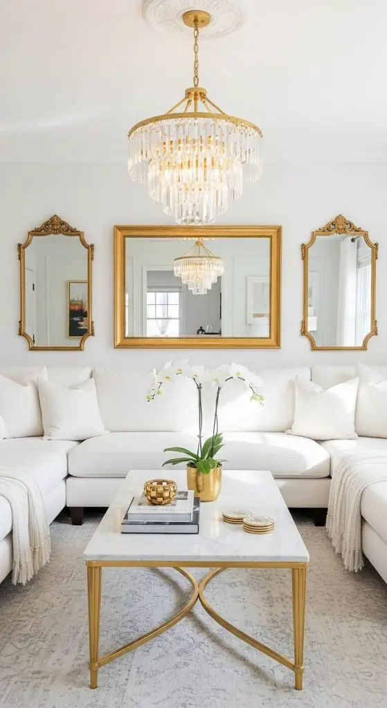
White and gold never go out of style. White walls and upholstery set the tone, and gold pops up in frames, mirrors, or even a luxe chandelier. Think “hotel suite chic.”
Pros:
- Brightens up small rooms.
- Works with modern or classic furniture.
- Instantly looks expensive.
Cons:
- White gets dirty fast (no kids with juice boxes allowed).
- Gold, if overdone, can scream tacky instead of classy.
Why it works: A Statista study shows white is still the #1 choice in luxury interiors, and pairing it with metallics like gold adds the glam.
2. Navy Blue & Beige – Effortless Sophistication
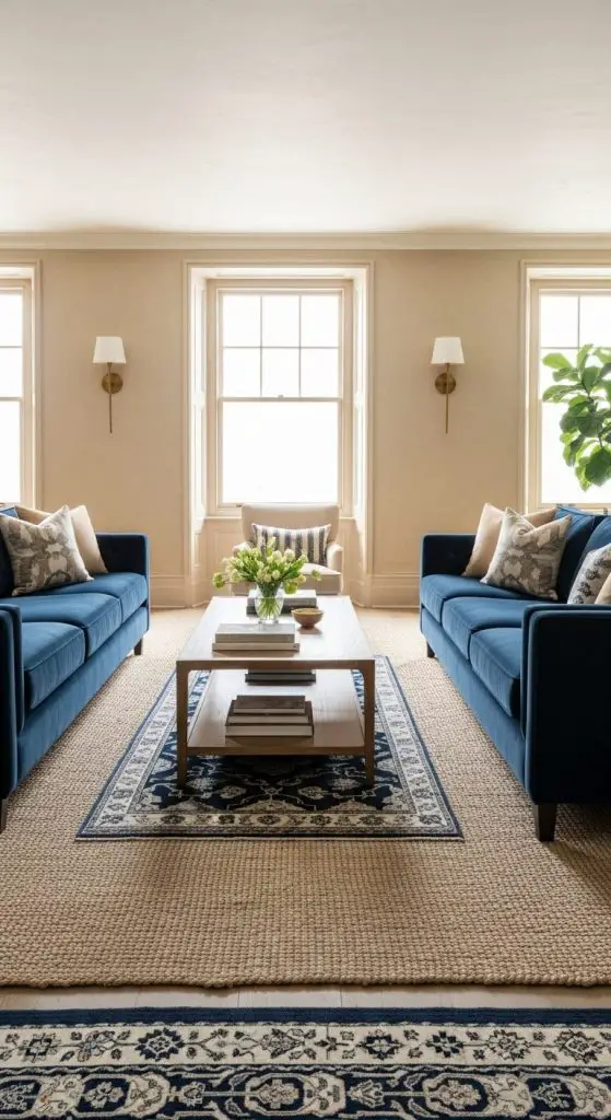
Navy and beige feel like that friend who always looks polished but never overdoes it. The navy brings depth, while beige keeps things warm.
Pros:
- Calming and welcoming.
- Works with wood and leather.
- Easy to accessorize with cushions and rugs.
Cons:
- Too much navy can feel heavy.
- Beige, if flat, risks looking bland.
Why it works: Houzz design trends report ranks blue as a top 5 luxury living room shade for relaxation and elegance.
3. Emerald Green & Brass – Bold but Regal
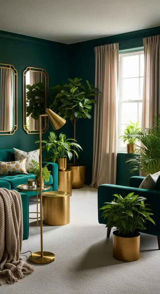
Emerald green screams confidence. Add brass finishes (like side tables or lamp bases) and you’ve got a space that feels opulent without trying too hard.
Pros:
- Green brings freshness and life.
- Brass accents warm up the boldness.
- Perfect backdrop for statement art.
Cons:
- Can overpower smaller spaces.
- Needs natural light to avoid looking gloomy.
Fun fact: According to Elle Décor, green is the color of renewal and a top choice for luxury spaces in 2024.
4. Charcoal Grey & Soft Pink – Chic & Unexpected
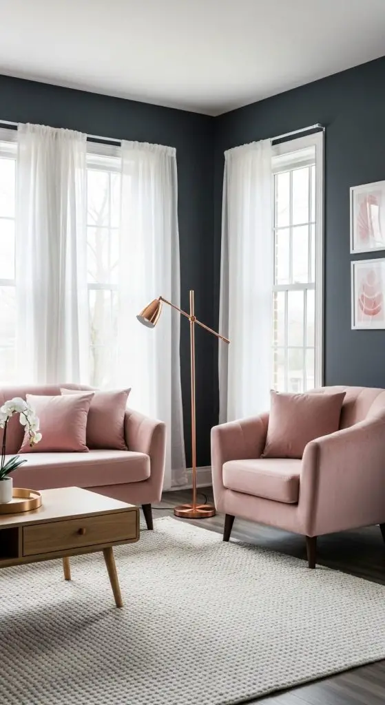
This combo is like that edgy friend who also has a soft side. Charcoal gives the drama, while blush pink softens the mood.
Pros:
- Works beautifully with velvet textures.
- Creates a cozy yet elegant vibe.
- Gender-neutral despite the pink.
Cons:
- Dark grey absorbs light—use in well-lit rooms.
- Can feel “too trendy” if not accessorized right.
Pro tip: Add rose-gold metallics for an Instagram-worthy finish.
5. Cream & Dark Wood – Warm Luxury
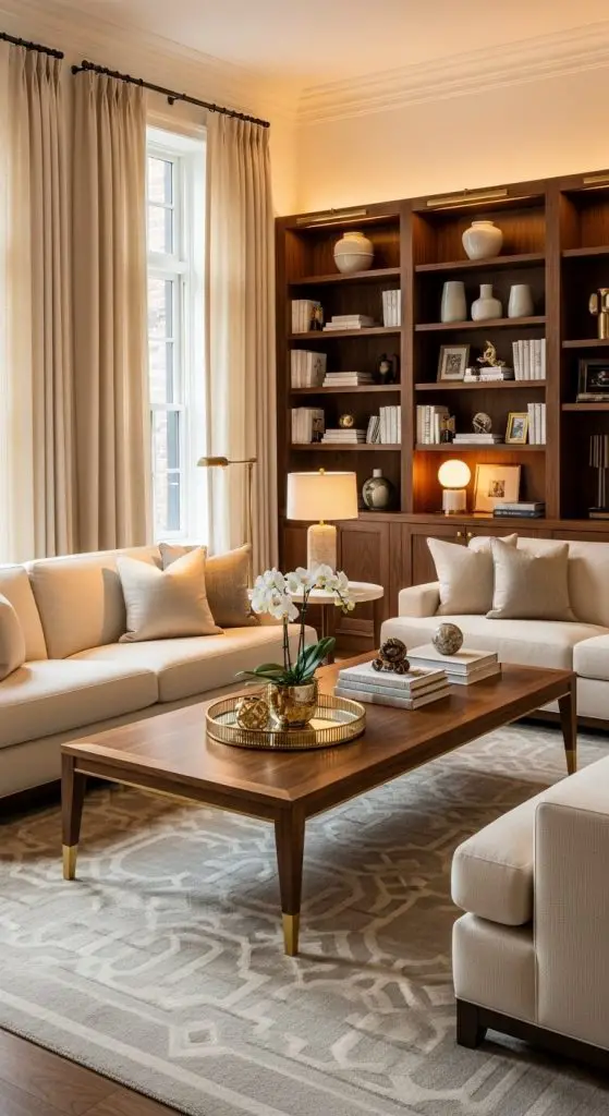
Nothing beats the warmth of cream walls paired with rich walnut or mahogany furniture. It’s timeless and oh-so-inviting.
Pros:
- Warm, cozy, and welcoming.
- Perfect for traditional or modern-classic homes.
- Wood brings natural luxury vibes.
Cons:
- Dark woods can dominate small spaces.
- Cream needs contrast or it risks looking washed out.
Fact: A 2023 Houzz survey found natural wood tones surged 28% in luxury living spaces.
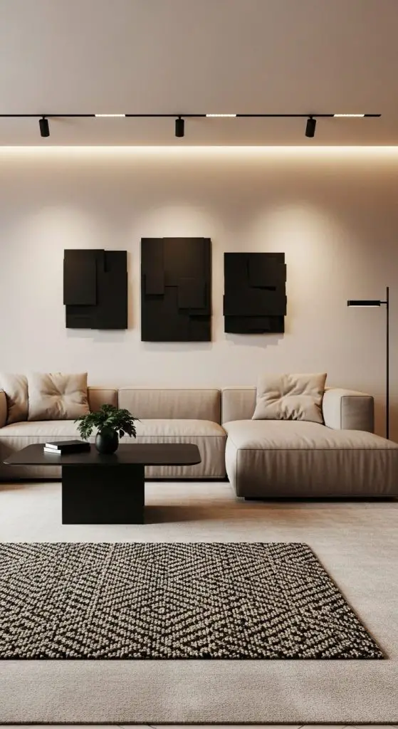
6. Black & White – High-Contrast Drama
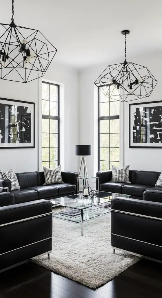
Classic. Bold. Sophisticated. Black and white never fail to impress, especially with clean lines and modern furniture.
Pros:
- Easy to accessorize with pops of color.
- Works across minimalism and glam styles.
- Feels timeless and striking.
Cons:
- Too much black can feel cave-like.
- Needs balance—otherwise it’s harsh.
Why it works: Interior Design Magazine calls black and white “the eternal luxury duo.”
7. Taupe & Teal – Modern Elegance
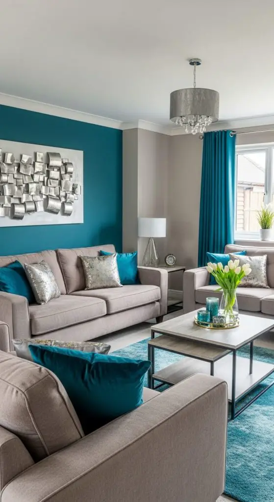
Taupe might sound boring until you pair it with teal. Suddenly, you’ve got a combination that feels luxe but approachable.
Pros:
- Calming but not dull.
- Teal adds energy.
- Works with metallic or wooden accents.
Cons:
- Teal accessories can be hard to match.
- Taupe without textures looks flat.
Pro tip: Teal velvet cushions = instant luxury.
8. Burgundy & Cream – Rich & Cozy
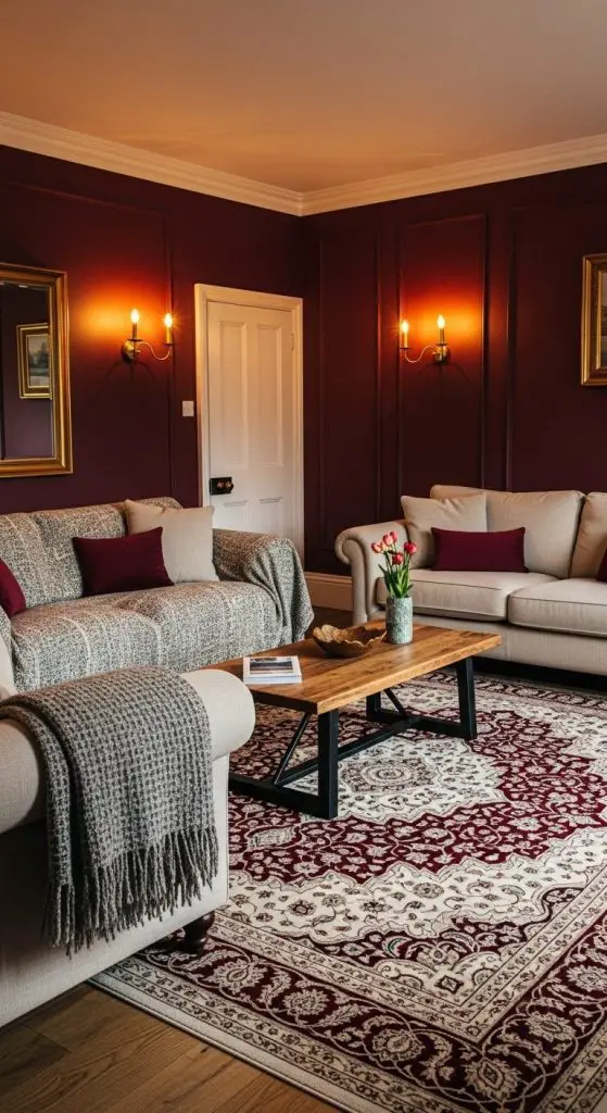
Burgundy feels indulgent, almost wine-glass-worthy. Cream balances it, preventing your living room from looking like a dark cave.
Pros:
- Rich, moody, and elegant.
- Cozy yet sophisticated.
- Great for cooler climates.
Cons:
- Too much burgundy can feel overwhelming.
- Needs light accents to stay fresh.
Fact: Psychology of Color studies show deep reds increase warmth and intimacy, perfect for a living room.
9. Olive Green & Gold – Subtle Luxury
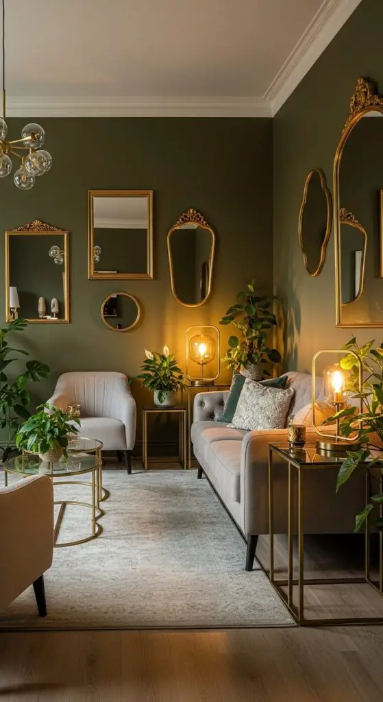
Olive green is earthy but when you throw in gold accents, boom—it feels expensive and grounded at the same time.
Pros:
- Natural, soothing vibe.
- Gold keeps it glam.
- Works beautifully with plants.
Cons:
- Can look dull without metallics.
- Needs warm lighting to shine.
Personal take: I once tried this combo in my own living room—plants + olive walls + golden frames = compliments every time.
10. Grey & Mustard Yellow – Contemporary Pop
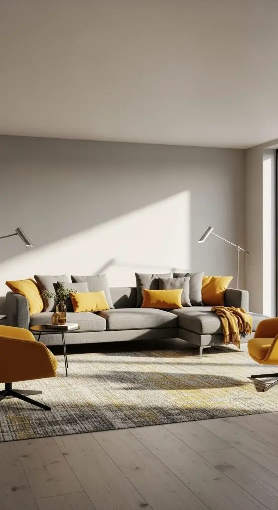
Grey is cool and understated. Mustard yellow? Bold and sunny. Together, they’re modern without being cold.
Pros:
- Brightens up neutral spaces.
- Feels playful yet mature.
- Easy to balance with accents.
Cons:
- Mustard can feel too “retro” if overused.
- Grey alone risks dullness.
Stat: Pinterest trend reports show yellow accents surged 45% in home décor saves in 2024.
11. Beige & Black – Minimalist Luxury
Beige softens the starkness of black, creating a chic minimalist aesthetic. Think modern penthouse vibes.
Pros:
- Balanced, versatile, and modern.
- Easy to style with metals or natural textures.
- Works for both small and large rooms.
Cons:
- Too beige = boring.
- Too black = overwhelming.
Why it works: Beige keeps things grounded while black adds just enough drama.
12. Sapphire Blue & White – Crisp & Regal
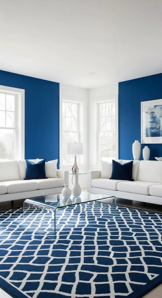
Sapphire blue feels regal, and when paired with white, it’s crisp and refreshing. Perfect for coastal-inspired luxury.
Pros:
- Bold without being overbearing.
- Bright and fresh.
- Great for statement rugs or walls.
Cons:
- Needs careful balance to avoid “nautical” clichés.
- White shows marks easily.
Fun fact: Blue is scientifically proven to lower stress levels, making it perfect for living rooms.
13. Ivory & Silver – Glamorous Serenity
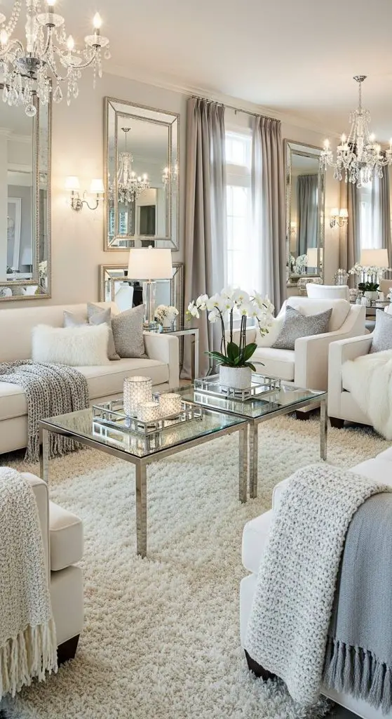
Ivory and silver are for those who love calm, serene vibes with a hint of sparkle. Think champagne evenings and Netflix marathons in style.
Pros:
- Soft, calming, and chic.
- Silver adds subtle glam.
- Works with glass décor pieces.
Cons:
- Can feel cold if not warmed up with textures.
- Needs good lighting to avoid flatness.
Pro tip: Layer faux fur throws for added luxury.
14. Chocolate Brown & Cream – Rich Comfort
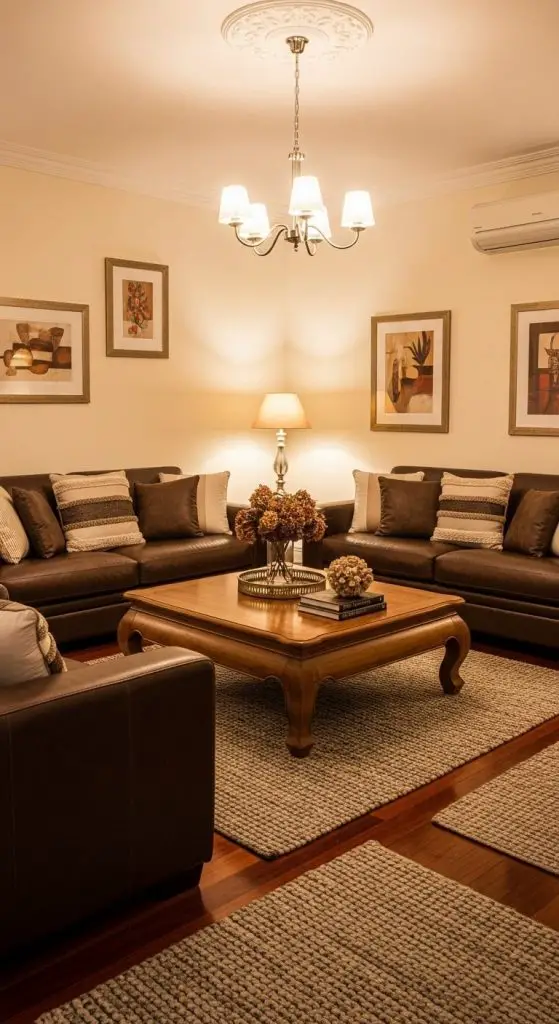
This is like hot cocoa in design form. Chocolate brown grounds the space, while cream lifts it up for balance.
Pros:
- Warm, cozy, and indulgent.
- Perfect for layering textures.
- Works with rustic or modern styles.
Cons:
- Dark shades need natural light.
- Risk of looking old-fashioned without modern accents.
Personal note: IMO, this combo never fails if you love cozy vibes.
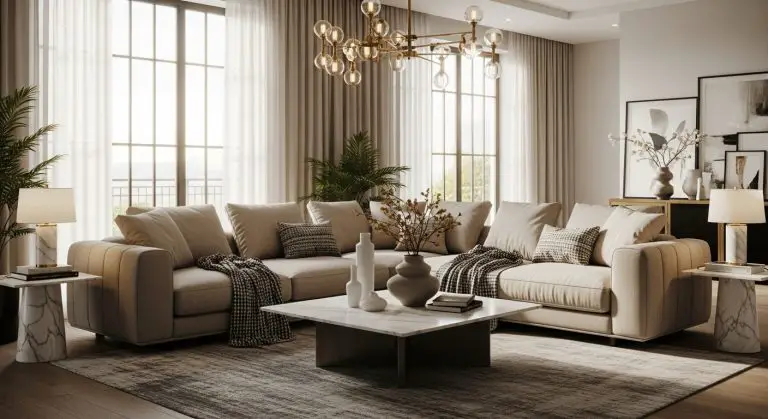
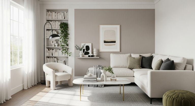
15. Monochrome Neutrals – Layered Luxury
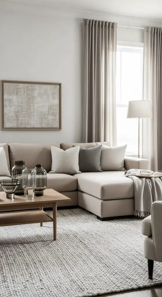
Here’s the trick: stick to one colour family (like greys, beiges, or creams), but play with tones and textures. Monochrome never looked so good.
Pros:
- Easy to style.
- Feels cohesive and calming.
- Lets textures shine.
Cons:
- Risks looking flat without contrast.
- Needs layering for depth.
Fact: Architectural Digest notes layering neutrals is a top luxury design trend in 2024.
Conclusion
There you go—15 luxury living room colour combinations that actually work in real life. Whether you love bold emerald, cozy burgundy, or classic black-and-white, the key is balance. Pair bolds with neutrals, soften darks with lights, and let textures do the heavy lifting.
So, which combo are you going to try? And remember—don’t just copy a Pinterest board. Play with these combos until your space feels like you. That’s the real definition of luxury.

Emma Davis specializes in designing healthier, WELL Accredited Professional and PhD in Environmental Psychology and more mindful living spaces. With a deep understanding of how environments impact well-being, she shares expert insights on HouzGem to help readers create homes that support both physical health and emotional comfort.